Charmaine Pollard identity design
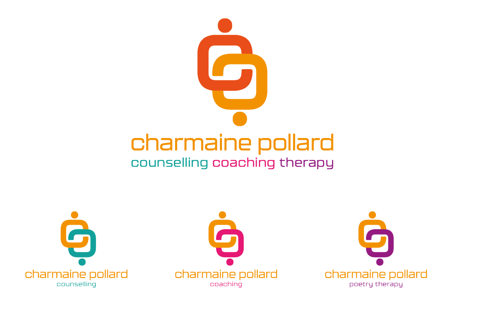
Charmaine Pollard wanted a logo that represented her and what she does, as a counsellor, coach and therapist.
The brief
The brief was to bring all aspects of her services under one brand. And create sub brands for specific programmes and workshops.
The problem solved
The logo icon is a stylised and interlocking C & P, which also represents two people connecting and communicating. The colour system in the logo breaks out into Charmaine's three sub brands. I chose the typeface to complement the curves of the logo's main icon.